Showing posts with label aj. Show all posts

Coloring Your Space

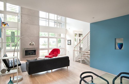
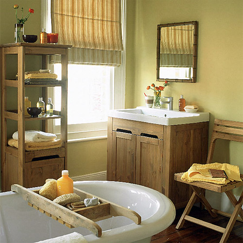
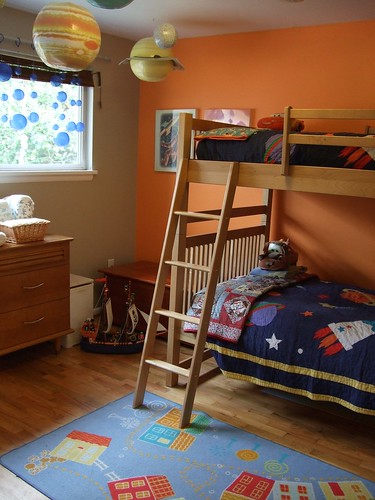
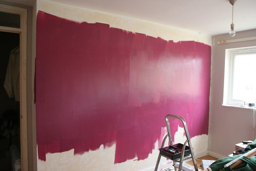
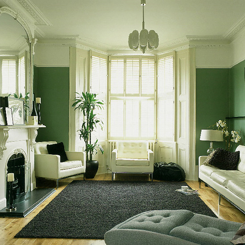
The colors on your walls impact the way your rooms feel.

Cool greens and blues seem to retract, making a space feel more open.


Warm yellows and oranges contract, making a space feel cozy.


And of course vibrant colors make a room come alive.


What color are your walls?

ORANGE

A little orange inspiration for you :-)


(images via weheartit)

Simultaneous Contrast

Just as jumping in a cold pool from a hot tub intensifies the cold, the contrast between two adjacent colors is accentuated. You can see this effect even in different shades of gray:


The two inner rectangles are actually the same color! The surrounding shades of gray give them the appearance of being different. This is called simultaneous contrast.

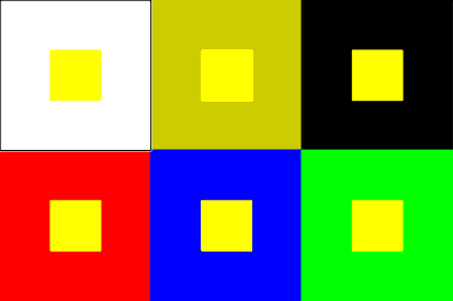
The same can happen with any set of adjacent colors. Red, for example, looks much brighter on black than on white; it appears vibrant on a blue background, but dulls as more yellow and magenta are added to the background (eg, brown). See the example below for yellow:


The same shade of yellow looks brighter or duller depending on the background color. This optical phenomenon can be lessened or removed entirely by adding a white or black outline between the opposing colors, because the effect is focused on a small area between the colors.

I think this is something many of us notice instinctively, but it helps to keep it in mind when designing with color :-) I hope you enjoyed this little installment of color theory by AJ! Now go color your world ;)

Fireworks!

In the spirit of 4th of July weekend (in America, we celebrate our independence with fireworks :)), here's some fun fireworks color trivia!

Gold fireworks are made using charcoal + iron + lampblack

For red,  strontium or lithium is used

Orange is produced with calcium salts

For yellow you need sodium

Green is made with barium

Copper is used to make blue tones

Purple-colored fireworks are made from copper + potassium or strontium

Silver results from titanium

And white fireworks have aluminum, magnesium, or titanium

Well, that was fun :D
Enjoy your weekend!!
(all images via weheartit)

Color Strength

 Johann Wolfgang Goethe (1749-1832) was a writer and a scientist, who expanded the ideas of color theory from Newton's purely physical theories to a one including our perception. He argued that color doesn't merely depend on the object and light, but also on our brains and our experiences.

In Designer's Color Manuel (by Tom Fraser and Adam Banks), I found Goethe's color ratio diagram, which I thought was really neat! It shows the visual strengths of the primary and secondary colors. Yellow is the strongest and violet is the weakest. This means that to balance the colors, you would need three times the amount of violet as yellow! The colors are rank as follows:
9 - Yellow (strongest)
8 - Orange
6 - Red
6 - Green
4 - Blue
3 - Violet (weakest)

Or compared in a graph:
9 - Yellow  
9 - Yellow   8 - Orange  
9 - Yellow   8 - Orange   6 - Red   6 - Green
9 - Yellow   8 - Orange   6 - Red   6 - Green   4 - Blue
9 - Yellow   8 - Orange   6 - Red   6 - Green   4 - Blue   3 - Violet
9 - Yellow   8 - Orange   6 - Red   6 - Green   4 - Blue   3 - Violet

Red and green are equal in visual strength, but you would need twice as much violet to compare. And you would need twice as much blue to balance any amount of orange. It's a simple system that you can use to balance all types of arts, crafts, even home decorating and your wardrobe :)

Shoes!

 For a long time I only bought shoes that would go with (nearly) everything. Brown and black shoes are must-haves. But what about shoes that pop? They are a great way to make an outfit shine! Do you have any bright shoes? My favs are a pair of yellow stilettos - couldn't resist!
(images from weheartit)

My challenge this week: Wear shoes that pop! Then post your photos on Flickr so we can see :)

Lavender

Not only is purple my favorite and signature color, it is my inspiration for the day! This morning I made a little project to match my friend's purple wedding color. And I've been thinking about just how many different shades of purple there are! Normally I lean toward bold, royal purples, but today I'd like to share a little lavender inspiration.
[images from weheartit]
 
Lavender is soft, fragrant, and romantic. It is my relaxing color.
What's yours?