

The two inner rectangles are actually the same color! The surrounding shades of gray give them the appearance of being different. This is called simultaneous contrast.
The same can happen with any set of adjacent colors. Red, for example, looks much brighter on black than on white; it appears vibrant on a blue background, but dulls as more yellow and magenta are added to the background (eg, brown). See the example below for yellow:
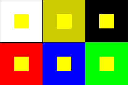
(source)
The same shade of yellow looks brighter or duller depending on the background color. This optical phenomenon can be lessened or removed entirely by adding a white or black outline between the opposing colors, because the effect is focused on a small area between the colors.
I think this is something many of us notice instinctively, but it helps to keep it in mind when designing with color :-) I hope you enjoyed this little installment of color theory by AJ! Now go color your world ;)
No comments:
Post a Comment