Johann Wolfgang Goethe (1749-1832) was a writer and a scientist, who expanded the ideas of color theory from Newton's purely physical theories to a one including our perception. He argued that color doesn't merely depend on the object and light, but also on our brains and our experiences.
In
Designer's Color Manuel (by Tom Fraser and Adam Banks), I found Goethe's color ratio diagram, which I thought was really neat! It shows the visual strengths of the primary and secondary colors. Yellow is the strongest and violet is the weakest. This means that to balance the colors, you would need three times the amount of violet as yellow! The colors are rank as follows:
9 - Yellow (strongest)
8 - Orange
6 - Red
6 - Green
4 - Blue
3 - Violet (weakest)
Or compared in a graph:
9 - Yellow
9 - Yellow 8 - Orange
9 - Yellow 8 - Orange
9 - Yellow 8 - Orange 6 - Red 6 - Green
9 - Yellow 8 - Orange 6 - Red 6 - Green
9 - Yellow 8 - Orange 6 - Red 6 - Green 4 - Blue
9 - Yellow 8 - Orange 6 - Red 6 - Green 4 - Blue 3 - Violet
9 - Yellow 8 - Orange 6 - Red 6 - Green 4 - Blue 3 - Violet
9 - Yellow 8 - Orange 6 - Red 6 - Green 4 - Blue 3 - Violet
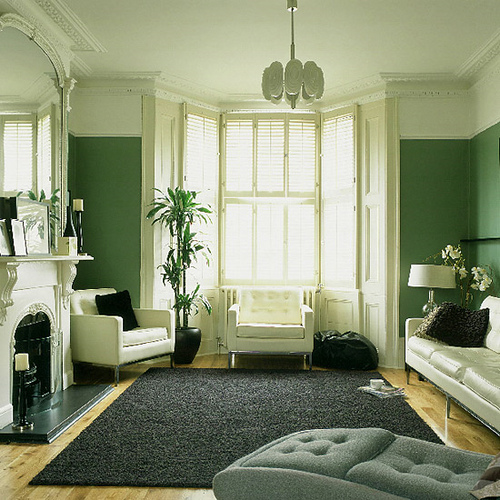
Red and green are equal in visual strength, but you would need twice as much violet to compare. And you would need twice as much blue to balance any amount of orange. It's a simple system that you can use to balance all types of arts, crafts, even home decorating and your wardrobe :)